Equities “Health” the Key as Trend Weakens on Aqua “Go” Bars
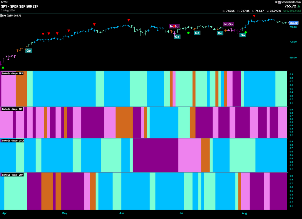
Good morning and welcome to this week’s Flight Path. The equity trend remained in place this week but we did see weakness with paler aqua bars as price fell from the high. The treasury bond price trend also hung on but again there was weakness with pink bars. U.S. commodities by contrast saw their “Go” trend stay very strong this past week with a string of uninterrupted bright blue bars and GoNoGo Trend painted strong purple “NoGo” bars for the U.S. dollar this week.

$SPY Stays in Weaker “Go” Trend
The GoNoGo chart below shows that the “Go” trend continues this week for the dollar but we are seeing weakness. Price had moved mostly sideway since the last Go Countertrend Correction Icon (red arrow) but eventually it fell on aqua bars. GoNoGo Oscillator also fell from overbought territory to ultimately test the zero line from above. We saw volume dry up as well as the oscillator transitioned from dark blue to aqua. We will watch to see if it finds support at the zero line. If it does, this would be a good sign for the “Go” trend.

The weekly chart shows that the “Go” trend continues and we saw another strong blue “Go” bar this week although it came with a lower weekly close. Price is still above the high from May and we will look for that prior high to act as support going forward. GoNoGo Oscillator is in positive territory but not overbought at a value of 3.

Treasury Rates Remain in Strong “Go” Trend Near Highs
GoNoGo Trend shows that the “Go” trend is clinging on to strength as the indicator paints a few more bright blue bars this week. We have not seen a significant break to a new high but we are seeing ever increasing higher lows. GoNoGo Oscillator continues to find support at the zero line but has spent less time in positive territory over the past several weeks. We will watch to see if this holds in the coming days.

Dollar ($UUP) In Strong “NoGo” at New Lows
The chart below shows that the “NoGo” trend was strong again last week as the indicator painted purple bars as price fell to a new low. This move lower was suggested when we saw the NoGo Trend Continuation Icon (red circle). This was triggered when GoNoGo Oscillator was turned away by the zero line and fell back into negative territory. Now, GoNoGo Oscillator is in negative territory but not oversold, confirming the price trend.

$USO Shows Strength This Week
GoNoGo Trend shows that the new “Go” trend thrived this past week as we saw nothing but bright blue “Go” bars as price tries to mount a challenge on the prior high. GoNoGo Oscillator is in positive territory but not yet overbought at a value of 3. With momentum confirming the price trend we will watch to see if this helps price challenge for new highs.

Gold ($GLD) “Go” Firmly in Place
The “Go” trend took off this week with price making higher highs on strong blue bars. The precious metal showed no signs of slowing down as GoNoGo Oscillator never fell to zero and is now back in overbought territory. This shows market enthusiasm for the move in the price panel. Volume continues to be strong as demonstrated by the darker blue color we have seen for a few weeks.

Sector RelMap
Below is the GoNoGo Sector RelMap. This GoNoGo RelMap applies the GoNoGo Trend to the relative strength ratios of the sectors to the base index. With this view we can get a sense of the relative out performance and relative underperformance of the sectors. 3 sectors is in a relative “Go” trend. $XLE, $XLB, and $XLV are painting blue relative “Go” bars.

Healthcare Sub-Group RelMap
The chart below shows a relative trend breakdown of the sub groups within the healthcare sector this week. The Sub-Group RelMap plots the GoNoGo Trend of each sub index to the $XLV. We saw in the above GoNoGo Sector HeatMap that $XLV is painting relative “Go” bars. When we look at the below RelMap we can see that the biotechnology index in the 4th panel has been painting strong “Go” bars on a relative basis for the longest time.

$AGEN Looks to Test Prior High Resistance
The GoNoGo Chart below shows that $AGEN has been in a “Go” trend since early July. We saw price gap immediately to highs that have not been surpassed since. With increasing lows, and with GoNoGo Oscillator being at or above the zero line the “Go” trend has survived. After a Go Countertrend Correction Icon (red arrow) indicating price may fail at resistance, we saw several weaker aqua bars as GoNoGo Oscillator entered a Max GoNoGo Squeeze. Now, GoNoGo Trend is painting strength and again challenging for new highs as the oscillator continues to find support at zero.

$RVMD Continues Healthy “Go” Trend Progression
The chart below shows $RVMD has been in a “Go” trend for a few months. We have seen higher highs and higher lows as price climbed over $220. We see a Go Countertrend Correction Icon a few bars ago telling us that price may struggle to go higher in the short term and indeed it has fallen away from that high. We will watch the oscillator panel as the indicator approaches the zero line. It will be important for the health of the trend for it to find support again at that level. If it does, we will know that momentum is resurgent in the direction of the “Go” trend and we will look for new higher highs.

BETTER CHARTS. BETTER DECISIONS.
- #RelativeStrength
- GoNoGo Asset Class HeatMap
- GoNoGo Charts
- GoNoGo Heat Map
- GoNoGo Oscillator
- GoNoGo RelMap
- GoNoGo Squeeze
- GoNoGo Trend
- S&P 500
- sector rotation
- US Treasuries